
CHEERS TO…INSTAGRAM’S font ‘Rosalia’
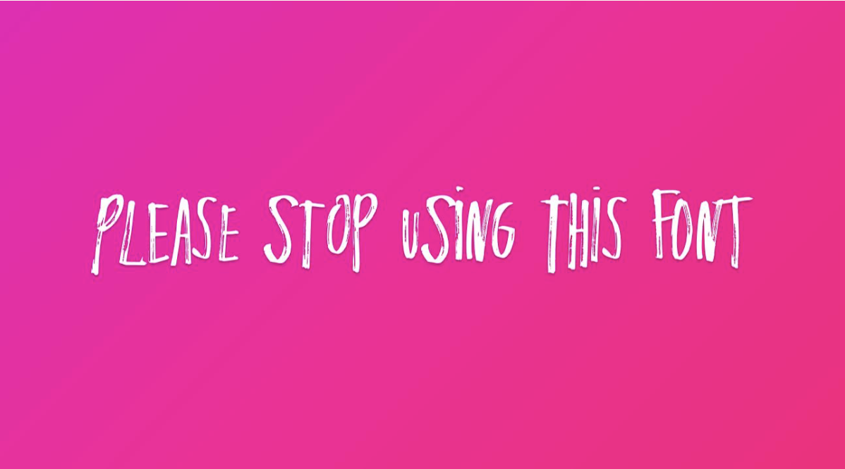
Instagram for giving it a red hot crack…but I hate it 🤮
Some time in the last month IG dropped a new limited-release font ‘Rosalia’ and in my eyes it's like an AI teenager diary scrawl. It's ugly, illegible, and I don't understand why people are using it.
Whilst some are calling it “fun” and “fresh”, I’m wondering if I'm out of touch?
Also - who is Rosalia? Am I showing my age by automatically assuming IG had collab'd with Melbourne influenza Rozalia Russian? I mean, I also have NFI who she is either, but the name was familiar (again - am I out of touch?).
Adam Mosseri (Head of IG, for those unacquainted) says the move is about encouraging creativity and “supporting people taking creative chances.”
But this feels less like a creative risk and more like an aesthetic identity crisis (with a side of Gen Z attention grabbing).
Bold of them to assume we wanted that in font form.
Whilst I'm all for taking a creative risk - I'll use my Literature font every day of the week, thanks Adam.
This piece first appeared in Excessive Consumption - a weekly dispatch on culture, branding, politics and whatever other modern internet brain rot the algorithm has emotionally assigned me that week.
Subscribers get every edition first. The archive opens later.